
The Gallery
Project Overview
I designed a user interface for an e-commerce art platform called The Gallery, focused on helping users discover and purchase a wide range of artwork, including pottery, posters, and paintings. The platform also highlights individual artists through dedicated portfolio pages and interactive features that encourage connection between artists and customers. I led the design process from concept to prototype, creating a site map, wireframes, and a high-fidelity prototype design in Figma. This project was completed as part of a Multimedia design course.
Problem Statement
Art buyers often struggle to discover unique, independent artwork through existing e-commerce platforms, while emerging artists lack accessible spaces to showcase their work and connect directly with customers. Many art marketplaces prioritize transactions over storytelling, making it difficult for users to explore artwork by category and understand the artists behind the work.
Goals & Success Criteria
Goals
- Design a user-friendly e-commerce platform that makes discovering and purchasing artwork intuitive
- Create a visually cohesive interface that enhances usability and encourages exploration
- Support a wide range of artwork types, including paintings, sculptures, and pottery
- Highlight artists through dedicated portfolio pages and meaningful interaction opportunities
- Incorporate subtle micro-interactions to provide feedback and improve user engagement
- Ensure the experience is responsive and accessible across modern devices and operating systems
Success Criteria
The design would be considered successful if:
- Users can navigate the website easily without confusion
- Artwork can be browsed and filtered by category in a clear and logical way
- Artist profiles are easy to find and encourage deeper exploration
- Micro-interactions reinforce user actions without distracting from usability
- The interface remains functional and visually consistent across desktop and mobile devices
Information Architecture
The information architecture for The Gallery was designed to support easy discovery of artwork while balancing the needs of both art buyers and artists. The platform is structured around clear navigation paths that allow users to browse artwork by category, explore artist profiles, and manage their accounts with minimal friction. The site map defines the overall structure of the platform and how key pages are organized.
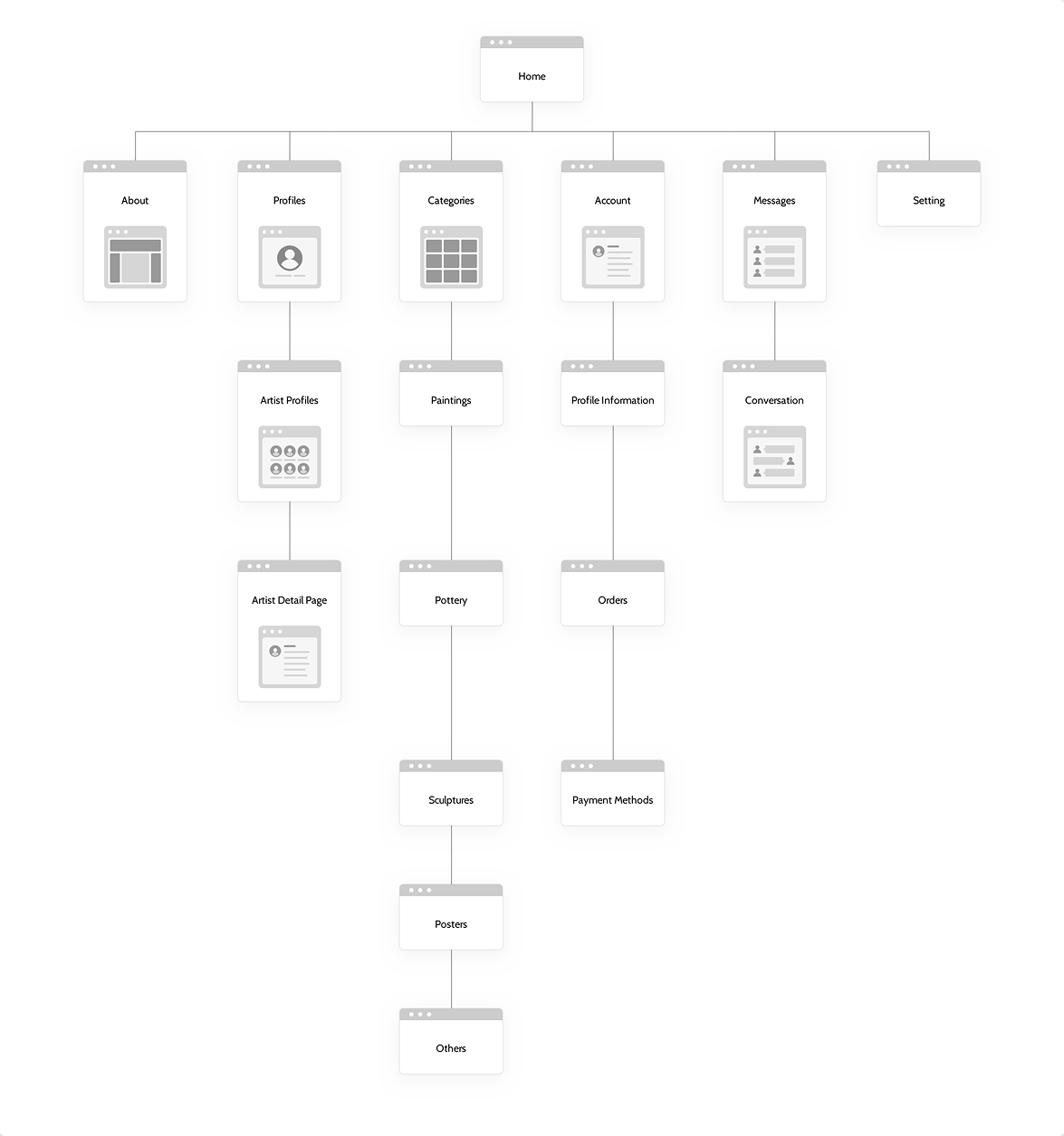
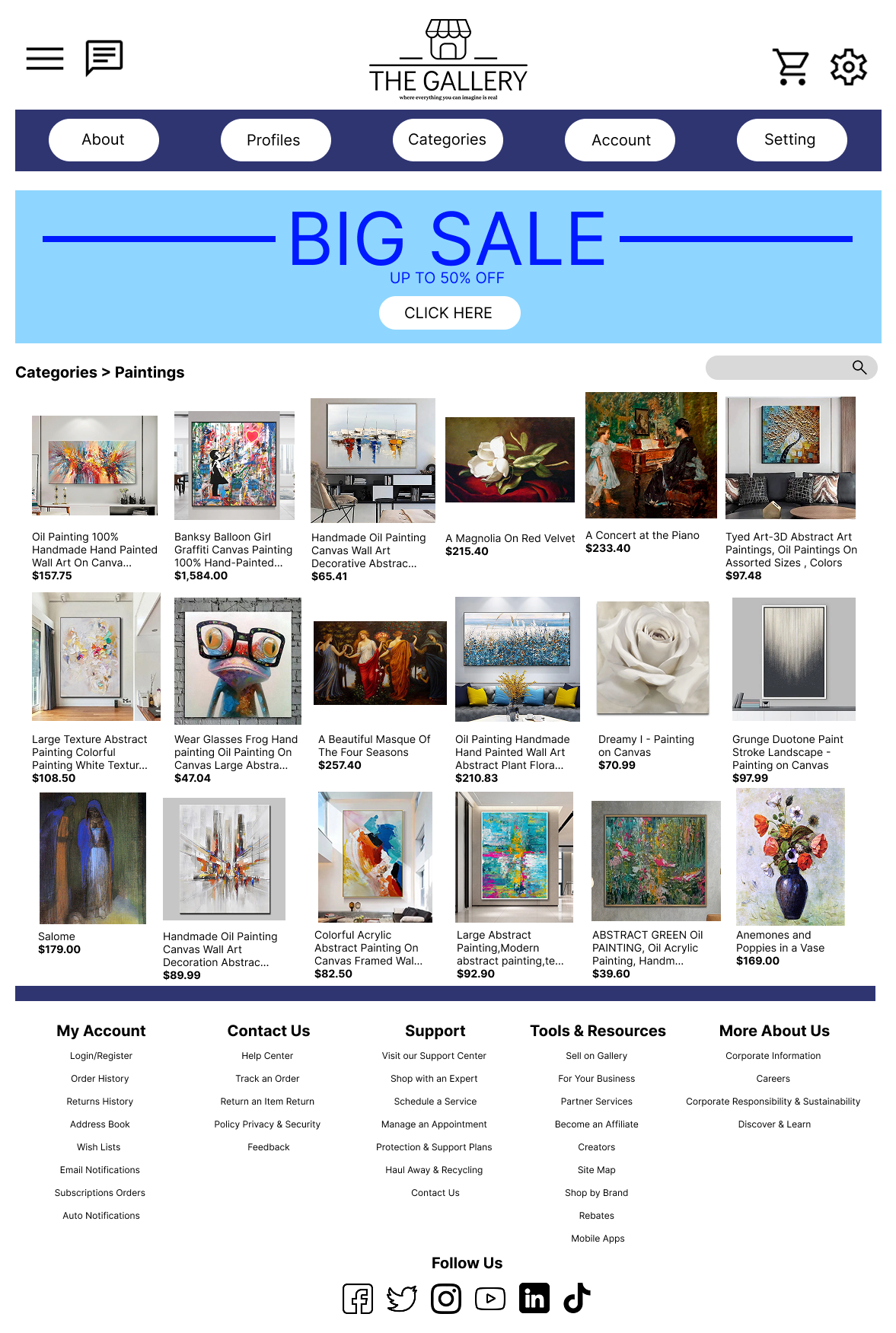
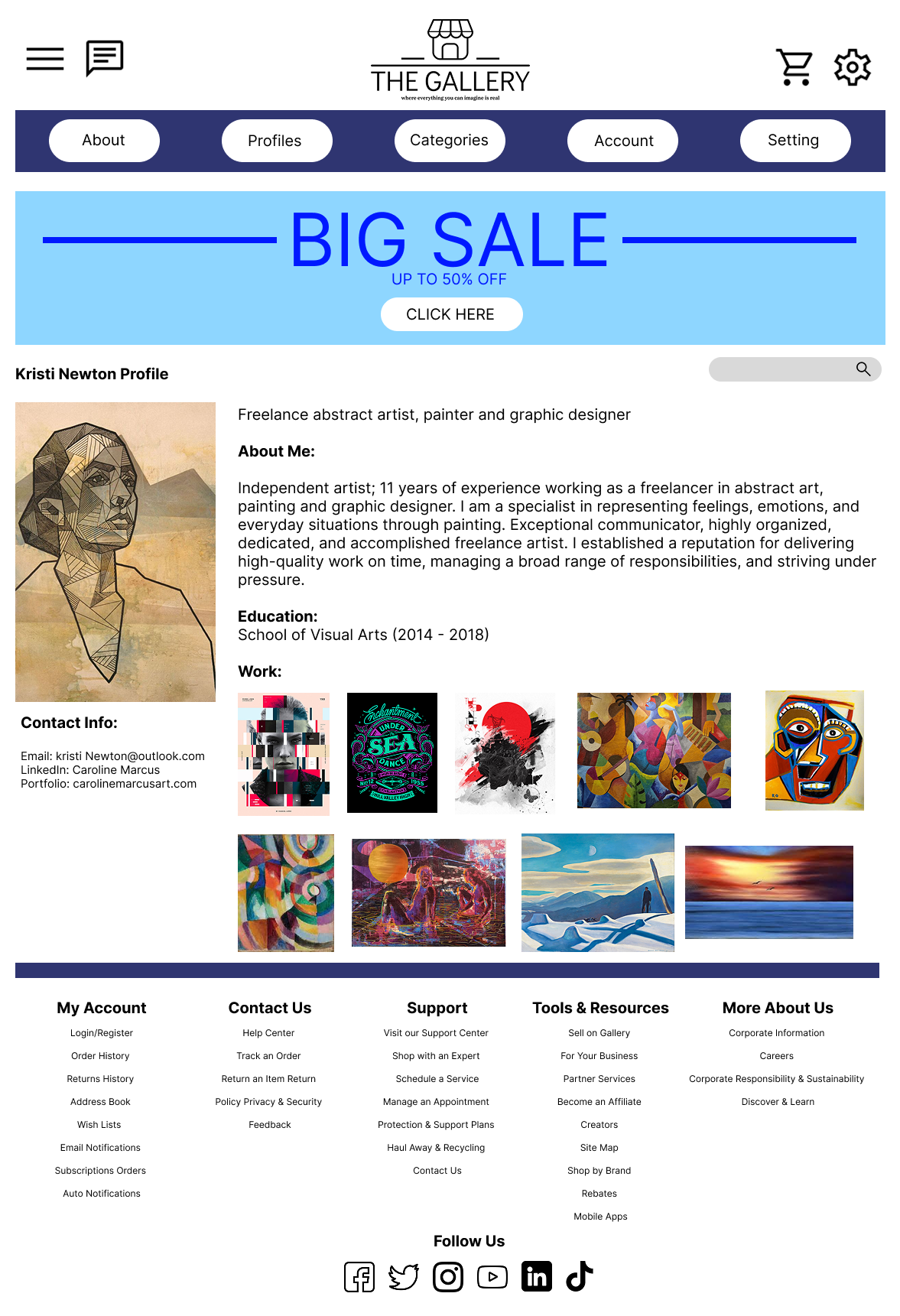
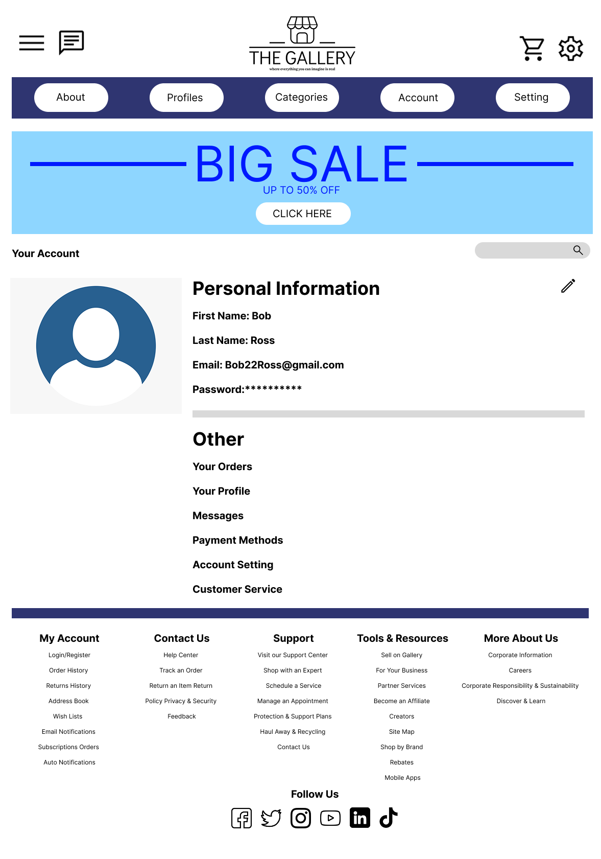
Primary navigation remains consistent across all pages and includes About, Profiles, Categories, Account, and Settings. This structure helps users quickly understand the site’s organization and access core sections regardless of where they enter the experience. Artwork discovery is supported through multiple entry points. The homepage highlights featured content, popular artwork, recommended items, and artist previews to encourage exploration. The Categories page allows users to browse artwork by type such as paintings, pottery, and sculptures, supporting users who prefer structured navigation. Search functionality further enhances discoverability across both artwork and artist profiles. Artist visibility is emphasized through a dedicated Profiles section, where users can browse creators and access individual artist pages. Each profile presents biographical information, contact details, and a gallery of work, reinforcing the platform’s goal of connecting users with the artists behind the artwork. Account-related actions are grouped within the Account section, separating personal information, order history, payment methods, and customer support from the browsing experience. Secondary navigation and support resources are placed in the footer to reduce visual clutter while remaining accessible. Overall, the information architecture prioritizes clarity, hierarchy, and ease of use, allowing users to move seamlessly between discovering artwork, learning about artists, and managing their accounts.
Wireframe
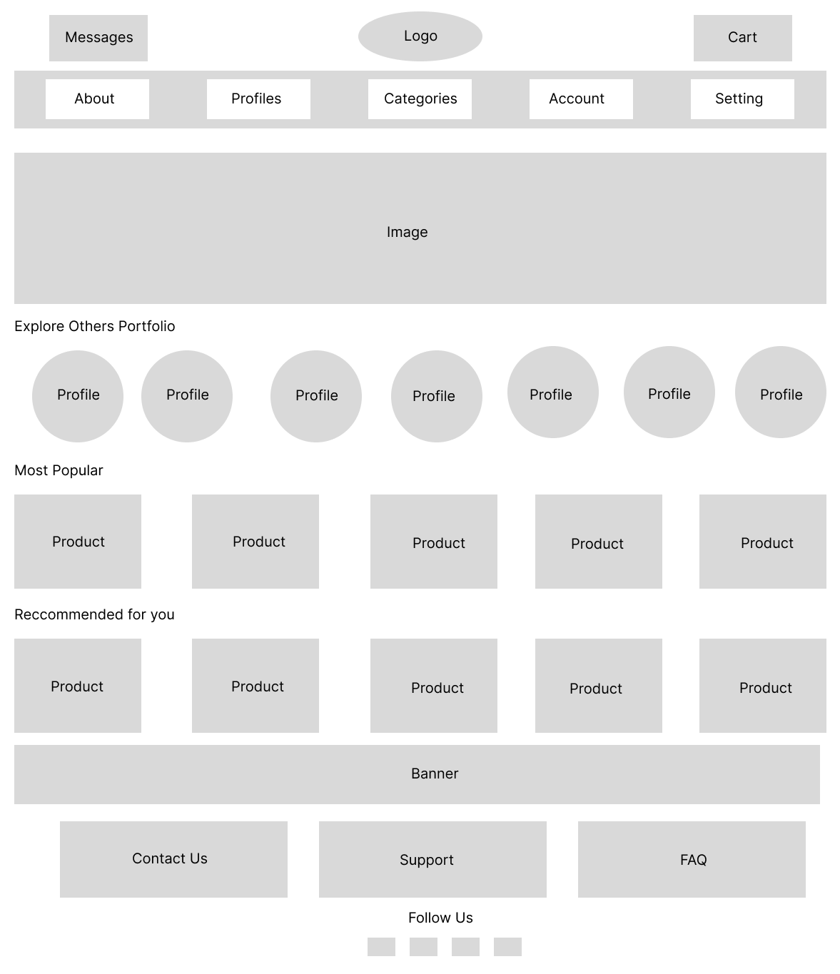
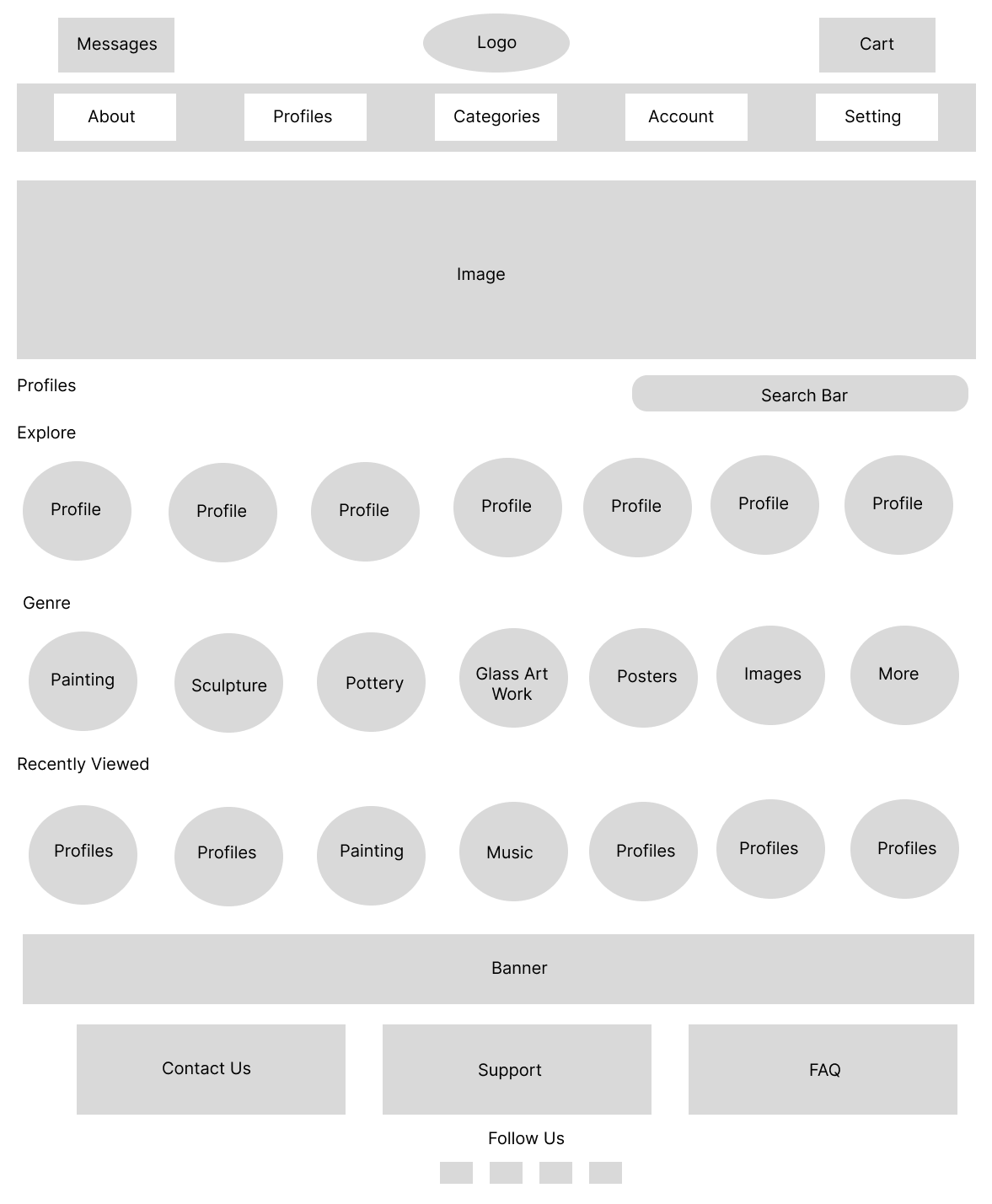
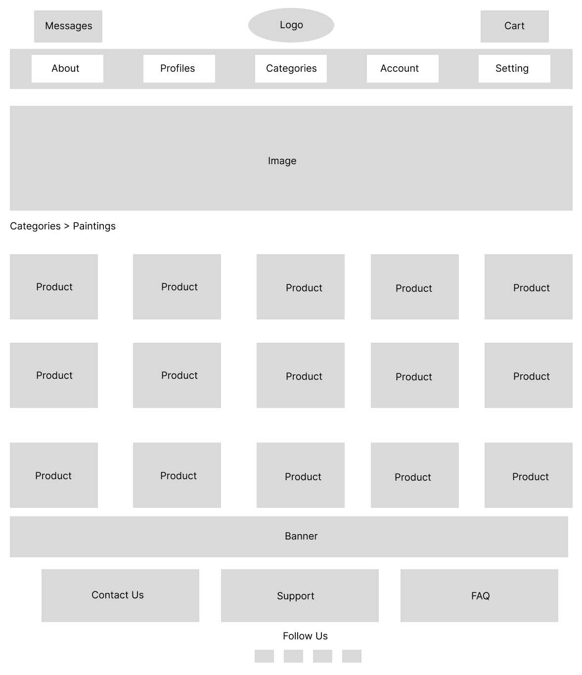
Wireframes were created to define the layout, content hierarchy, and overall structure of the platform before applying visual design. This stage focused on clarity and usability, ensuring users could easily navigate the site and explore artwork without distraction from visual styling. The homepage wireframe prioritizes artwork discovery by placing featured content, artist previews, and product sections in a clear vertical hierarchy. Primary navigation and key actions such as messages, cart access, and category browsing are positioned consistently at the top of the page to support quick orientation. Category page wireframes were designed to support efficient browsing by displaying artwork in a grid layout that allows users to scan and compare items easily. Clear section labeling and consistent spacing help reduce cognitive load while maintaining flexibility for different artwork types. The profiles page wireframe emphasizes artist visibility by showcasing profile previews, genre groupings, and recently viewed content. This structure encourages exploration while making it easy for users to discover and revisit artists they are interested in. Across all wireframes, design decisions focused on simplicity, consistency, and scalability, creating a flexible foundation for visual design and interactive elements in later stages.
Visual Design
The visual design of The Gallery was created to keep artwork as the focal point while maintaining a clean, approachable interface. A restrained color palette and consistent layout were used to support usability without competing with the artwork itself.
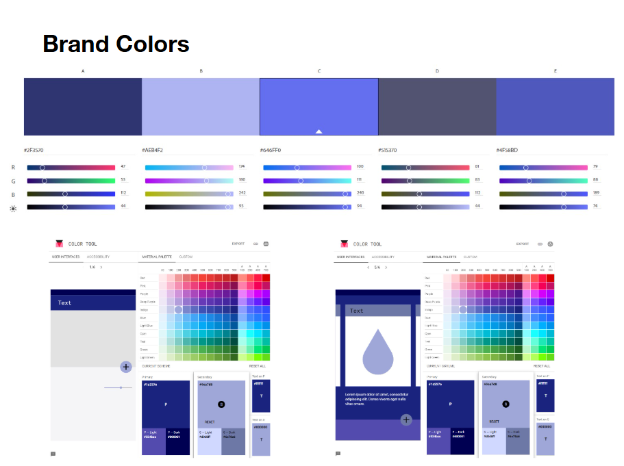
A blue-based brand color system was chosen to convey trust and professionalism while providing enough contrast for navigation elements, calls to action, and key interface components. Lighter tones are used to create visual separation between sections, while darker shades anchor navigation and footer areas.
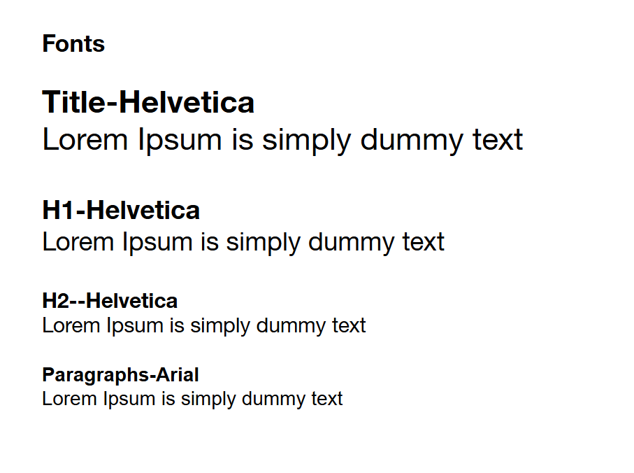
Typography choices emphasize clarity and hierarchy. Helvetica is used for titles and headings to create a clean, modern look, while Arial is used for body text to ensure readability across longer content such as artist descriptions and account details. Clear distinctions between heading levels help users quickly scan and understand page content.
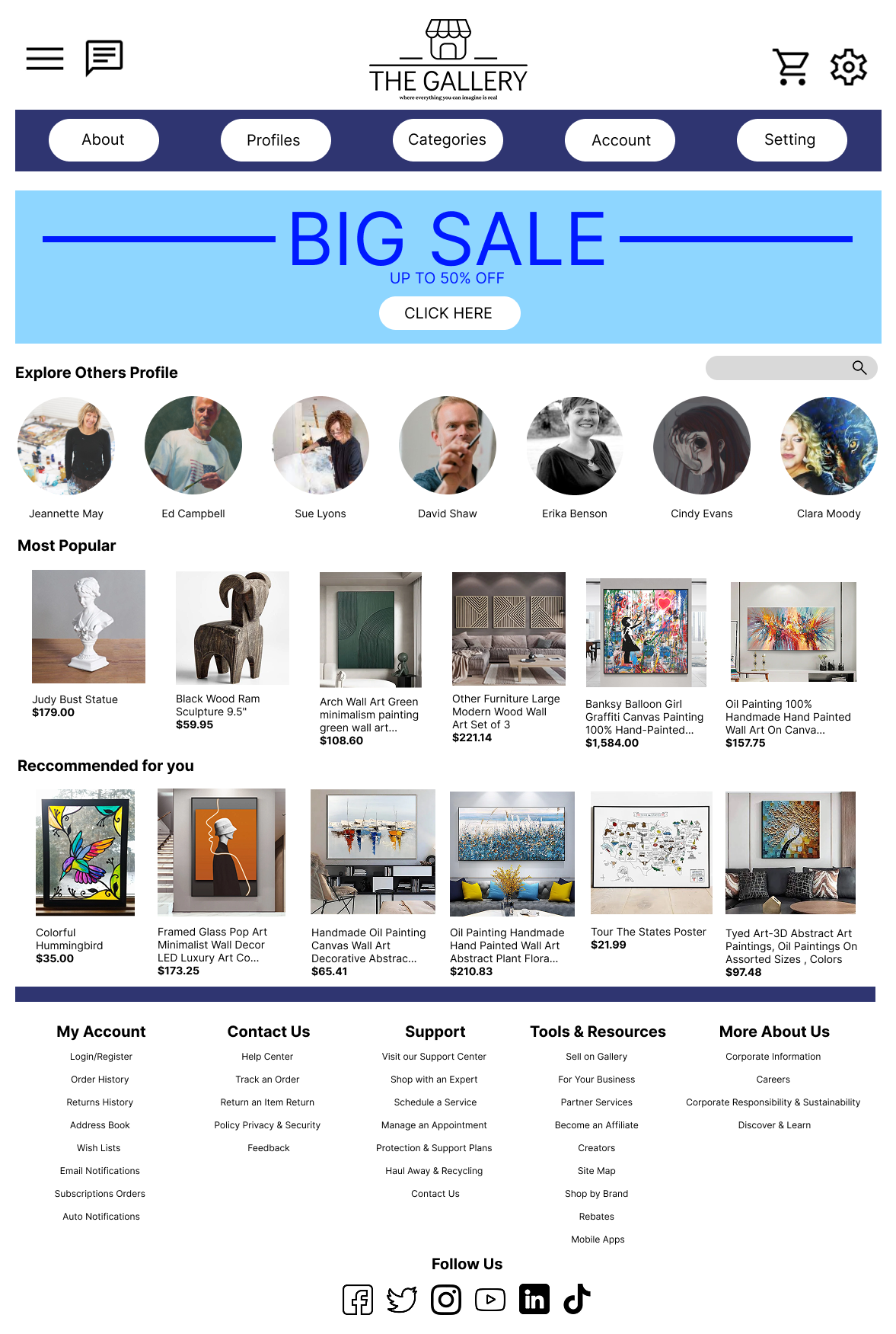
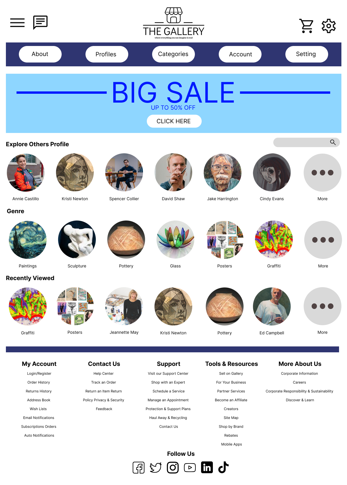
Final interface screens, including the homepage, category pages, artist profiles, and account views, apply consistent spacing, alignment, and component styling. Grid-based layouts support browsing and comparison of artwork, while rounded elements and subtle visual accents help guide attention without overwhelming the experience. Overall, the visual design reinforces usability and consistency across the platform while allowing the artwork and artists to remain central to the user experience.
Evaluation & Next Steps
Due to project scope and time constraints, formal usability testing was not conducted. Instead, the design was evaluated against established UX principles such as clarity, consistency, and ease of navigation to ensure a user-friendly experience. If further development were possible, usability testing would be conducted to assess how easily users can browse artwork, navigate artist profiles, and understand the purchase flow. Feedback from these sessions would inform refinements to navigation structure, content hierarchy, and interaction design. Future iterations of the project would focus on developing a fully interactive prototype, refining micro-interactions, and optimizing the experience for mobile users. Additional features such as saved favorites, enhanced search filters, and improved artist discovery tools could further support user engagement and platform growth.
Reflection & Learnings
This project strengthened my understanding of the UX design process from problem definition through visual execution. Designing The Gallery helped me practice translating abstract goals into structured layouts, clear navigation, and cohesive visual systems. One of the key learnings from this project was the importance of information architecture in shaping the overall user experience. Creating a clear site structure early on made later design decisions more efficient and consistent across pages. If revisiting this project, I would prioritize building a fully interactive prototype and conducting usability testing to validate design assumptions and uncover usability issues earlier in the process. This experience reinforced the value of iteration and user feedback in creating effective product experiences. Overall, this project contributed to my growth as a UX and product designer and provided a strong foundation for future work in user-centered digital design.